Advancing Peace & Security
Capturing 50 years of impact in one volume is a tall order, but that's just what we accomplished when creating Advancing Peace & Security.
I worked closely alongside the Editor-in-Chief to carefully curate content across five decades. And while my main duty was as Photos Editor, I played a major role in every step along the way from making decisions on the size, cover materials, and paper, to the design and layout. Our team of two worked with a design vendor and a printer to bring this project from concept to a 120-page coffee table book in about seven months.
I spent hours and hours poring over prints, contact sheets, and negatives to find just the right photos throughout the book.
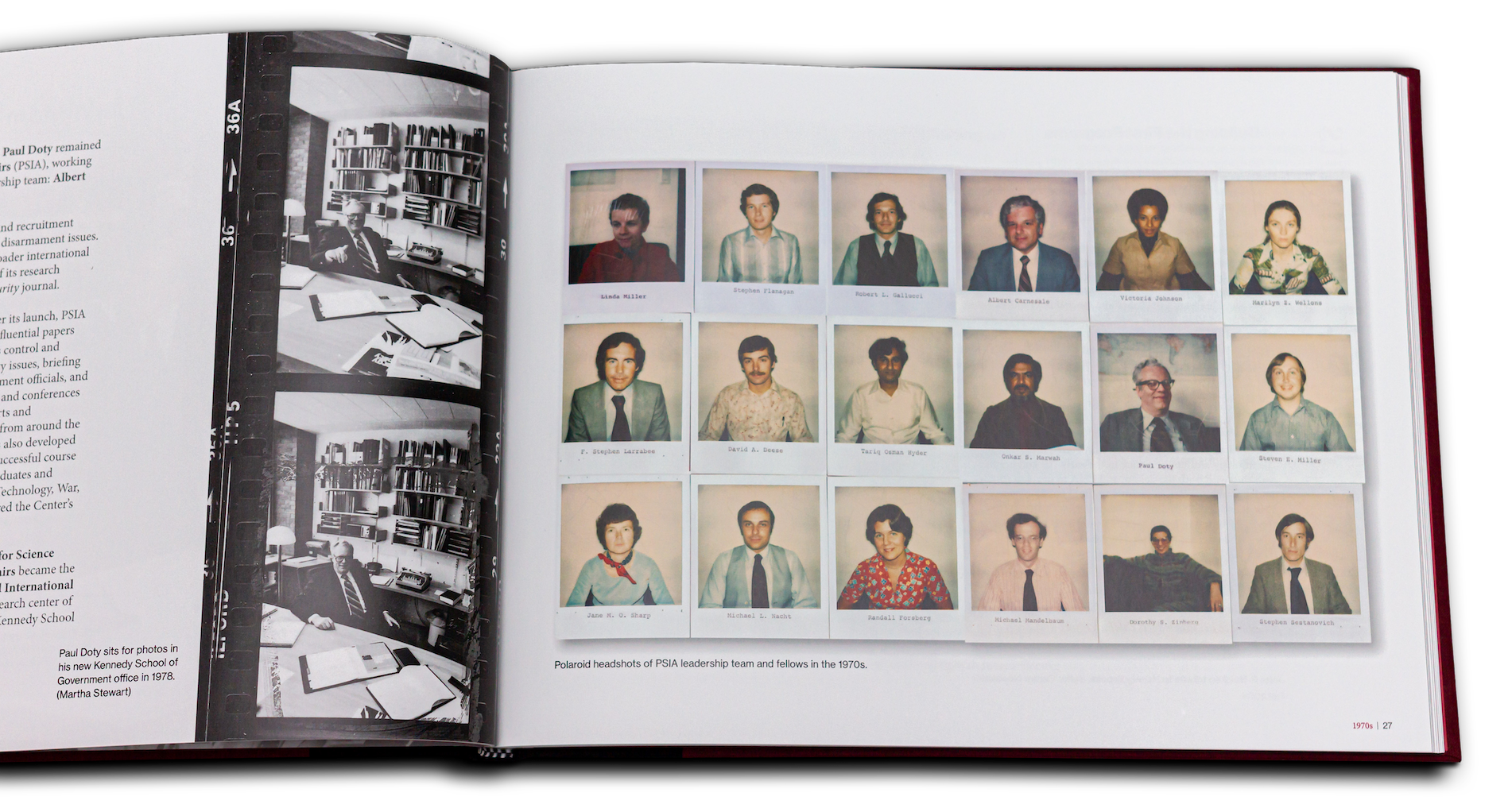
I decided to keep the look of the film strip and Polaroids to maintain the authenticity of the originals as well as give readers a "behind-the-scenes" look at the photo outtakes that show personalities in ways that words often can't.
While we used photos from a few sources, including our own archive, the rest of the photos were all ones that I took over my decade at the Center.
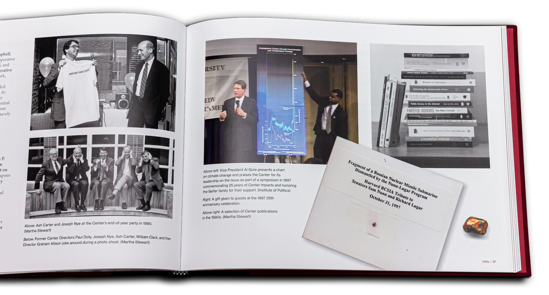
I made a strong effort to get a good mix of visuals in the book. Finding historical artifacts from a Center whose main impacts were on paper was a challenge, but when we did get our hands on them, I made sure to feature them as a way to add visual depth.
While this page displays my original photos and layout ideas, it also demonstrates my efforts to coordinate the colors on the cover, endpaper, and crimson headline text.
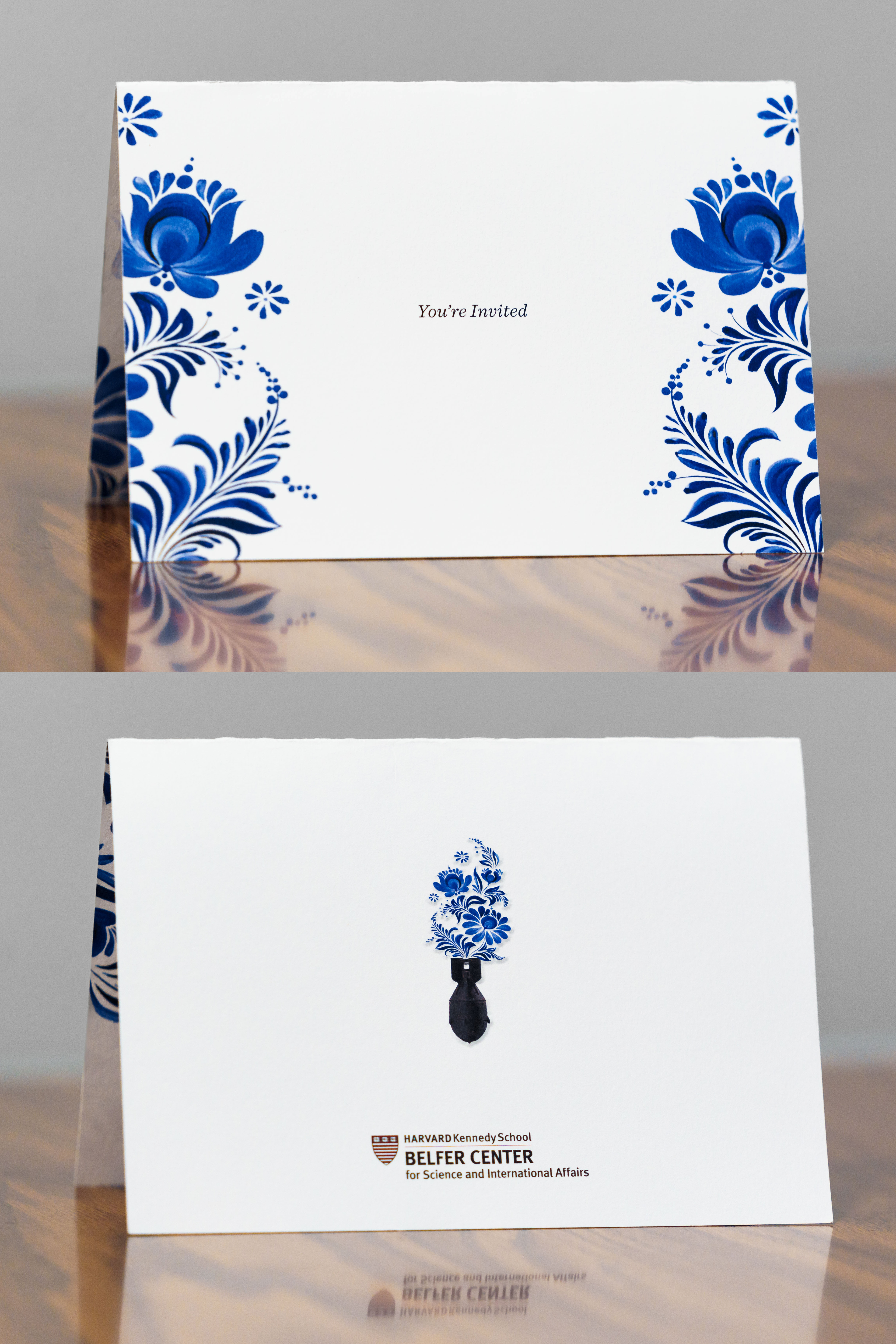
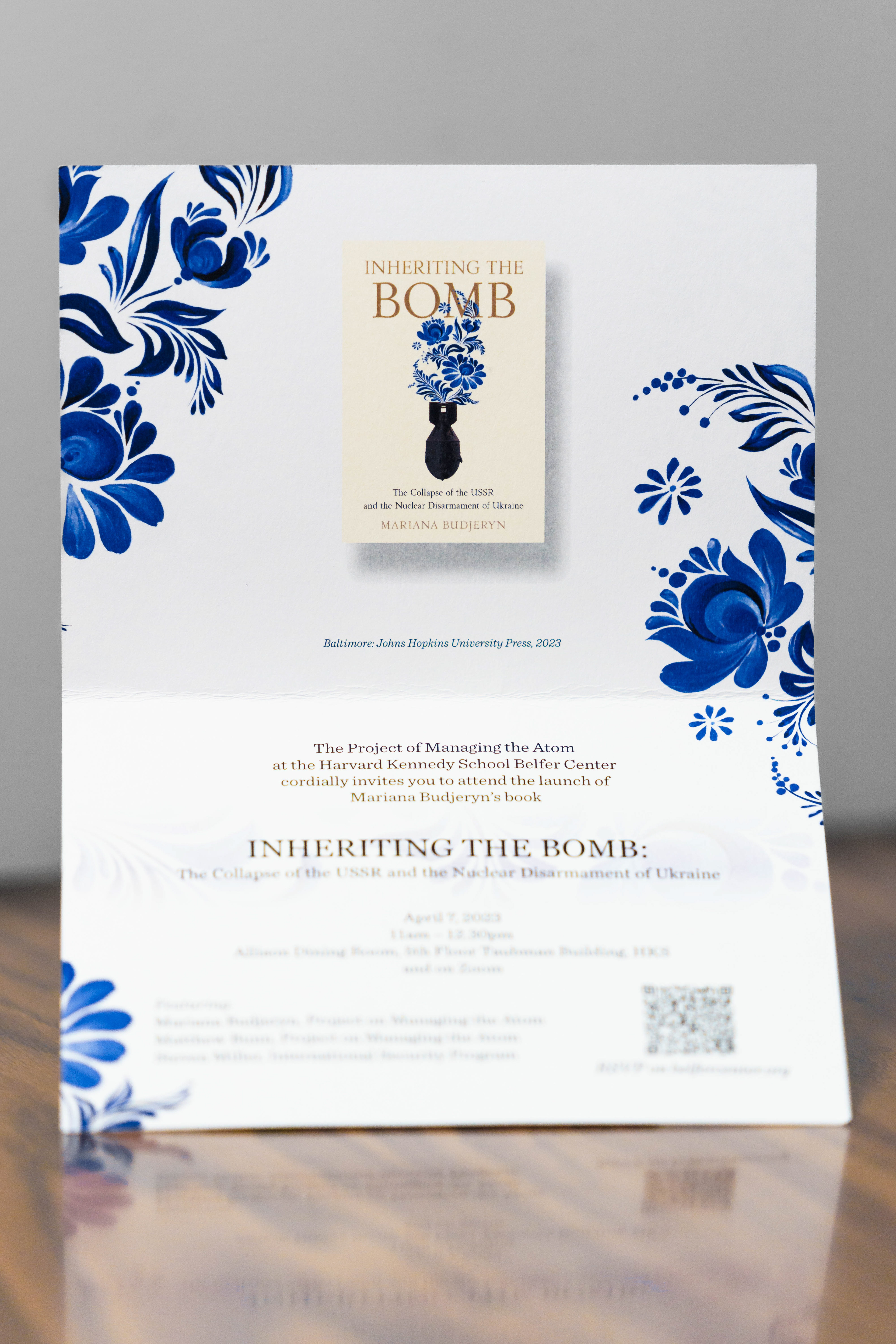
Event Invitation
This is a custom invitation created on short notice to send to major donors and stakeholders for a book launch event. I used the floral design from the book cover as a motif for the invitation, going so far as to recreate the parts obstructed by the title so there was a clean icon to use on the back and for other products.
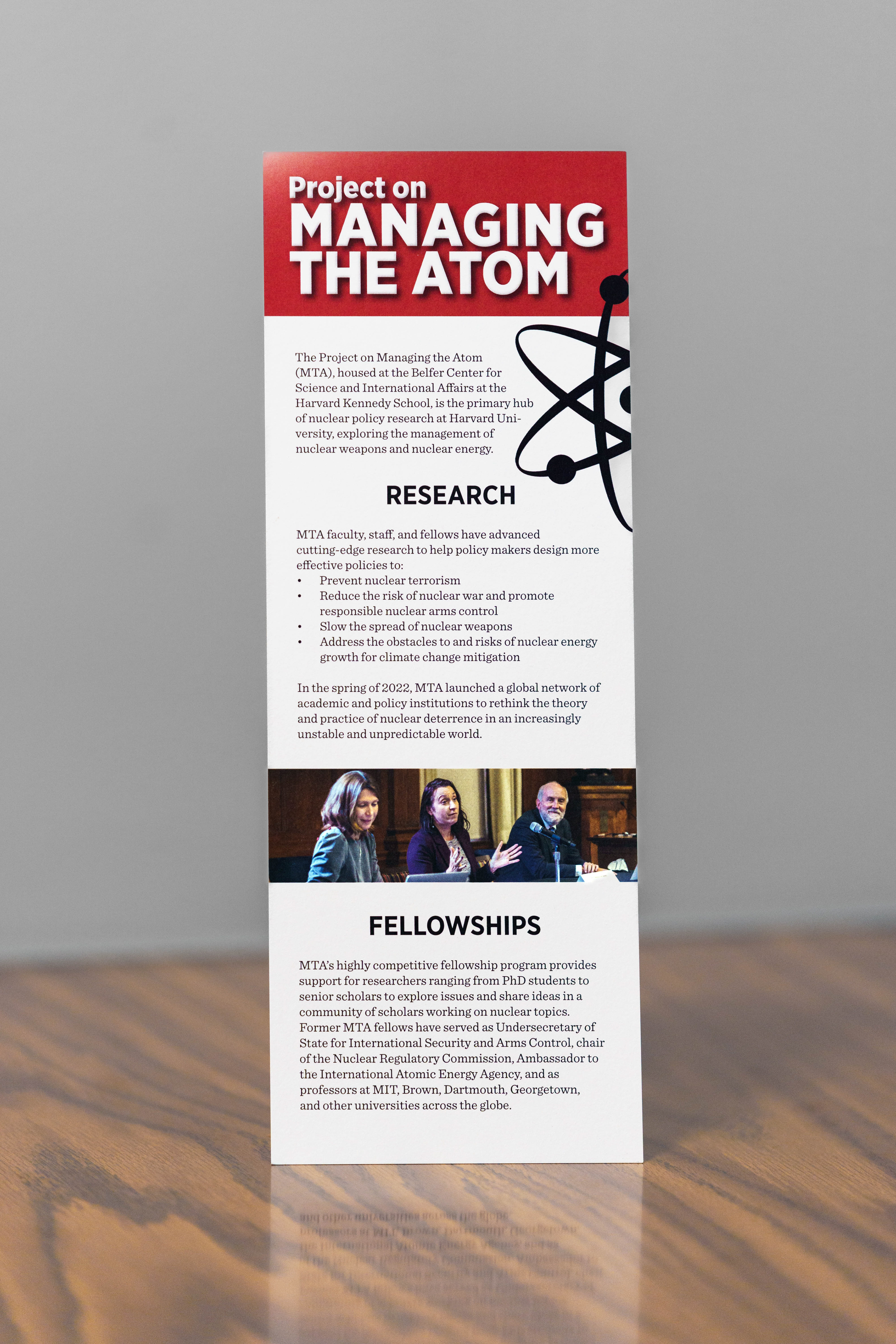
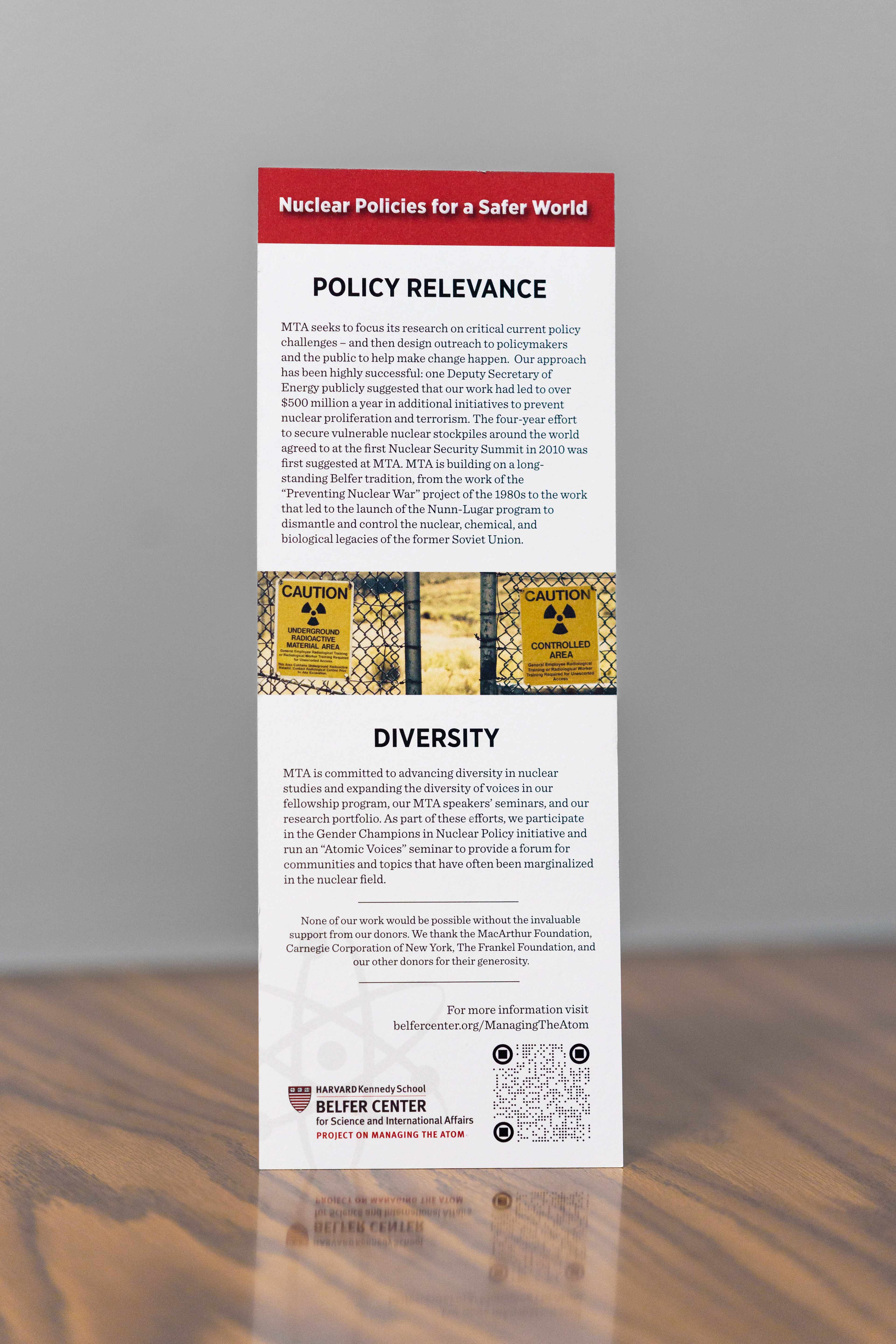
Brochure
When I was asked to make a trifold brochure for a project to hand out at a major donor event, I suggested that this bookmark format at 11"x4.25" on cover stock would give a more premium tactile feeling while being easy to tuck into stacks of papers, folders, etc. without getting lost in the shuffle or sticking out awkwardly. This product has been so useable for various events, conferences, and meetings that it has been reprinted three times in less than three months.
Posters
First, a poster for an event series designed with the sight lines and postering locations at Harvard Kennedy School in mind. To stand out it needed to be bold, eye-catching, and readable at a distance as students move through the hallways. A study of existing postering was conducted to ensure that I didn't create anything that would use colors or design motifs that would blend in amongst the already crowded bulletin boards.
The stark white cutout of the African continent conveys emptiness, as many feel that African issues are largely absent from discourse at Harvard Kennedy School. The Pan-African colors are used for the text and the shading was used to create depth and a rounded contour to the lettering.
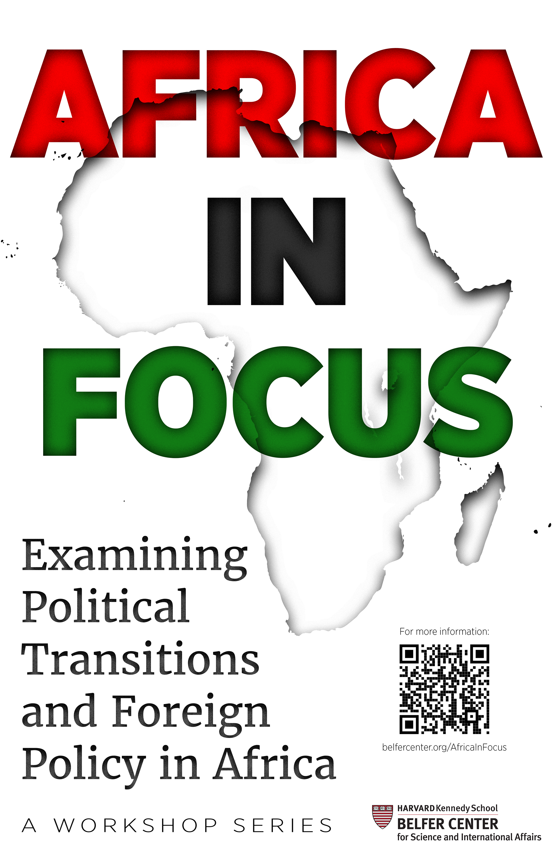
A detail of the lettering.
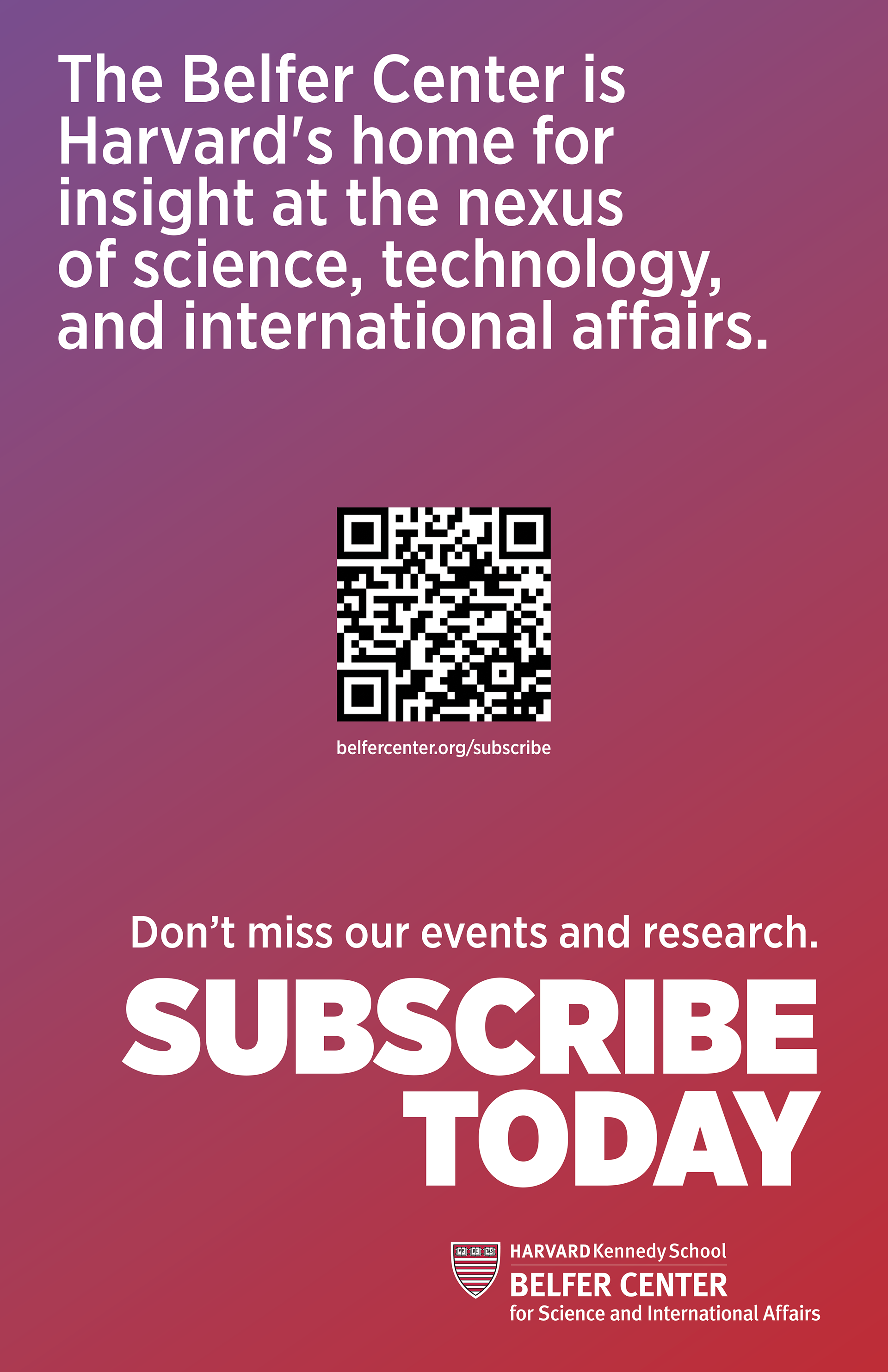
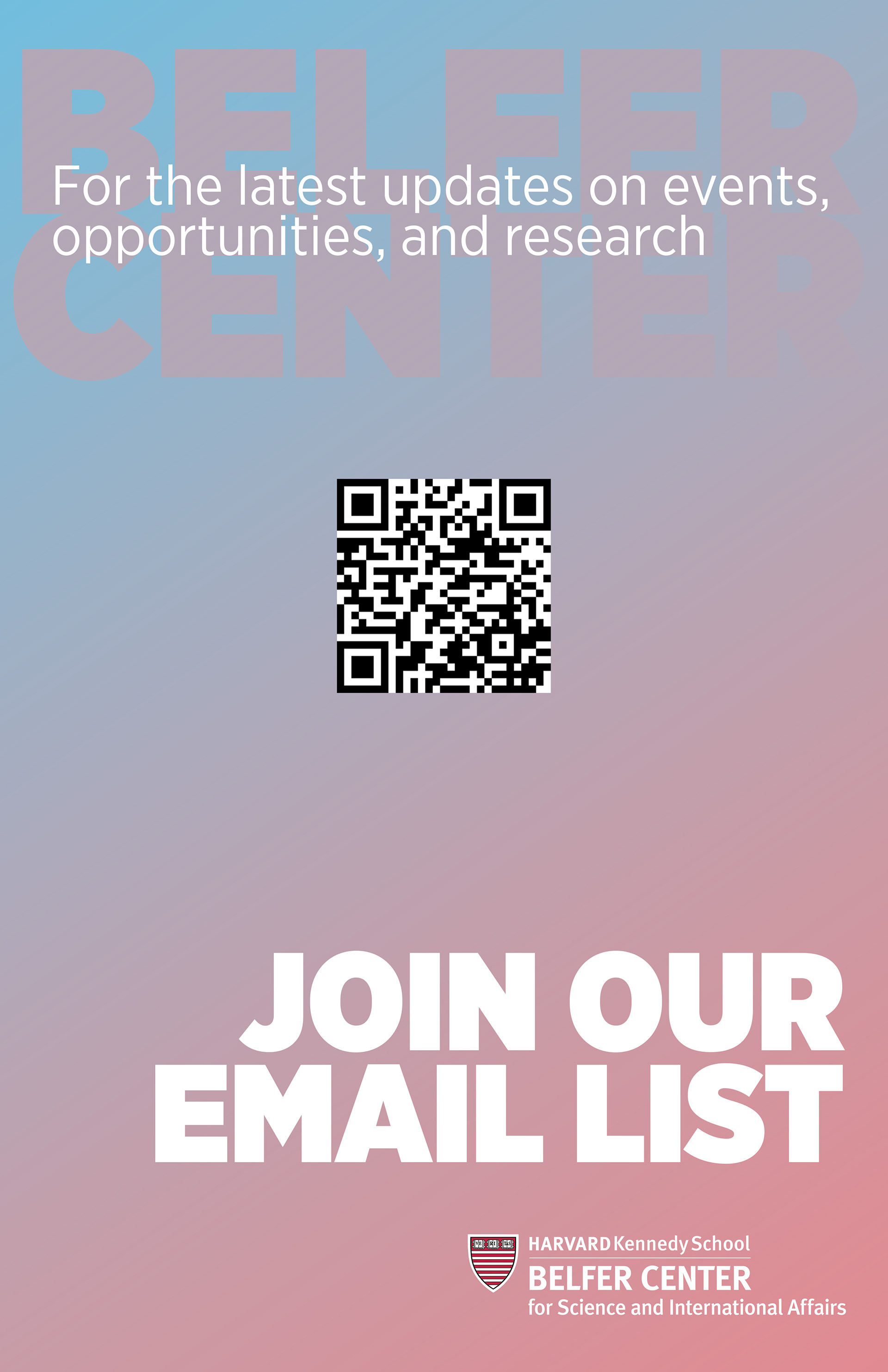
Second, tasked with creating a poster that would help boost email subscription amongst the student body, I designed this poster with bright, bold colors and big text to be eye-catching and readable at a distance. The central positioning and space around the QR code leaves no ambiguity about the call to action.
In the early draft on the right, the focus was placed much more on the call to action. From afar, viewers would see a QR code and "JOIN OUR EMAIL LIST" and know just what to do. Much of this initial design was carried over to the final product on the left.
Research Publications
A Decade of Diplomacy: I inherited the initial layout for A Decade of Diplomacy—from a talented colleague who left the team—and ran with it, adding sections, graphics, and my own photography to enhance the impact of this retrospective.
Belfer Center Newsletter: Historically, the Belfer Center's newsletter cover was always laid out more like a newspaper; one or two small photos and a feature article. After pushing for bigger and bolder photos on the cover, I mocked up this collage as an alternative to featuring only one or two of the alumni we were proud to showcase. This cover represented a shift in how our team thought about presenting our print newsletter, leading to bolder graphical covers.
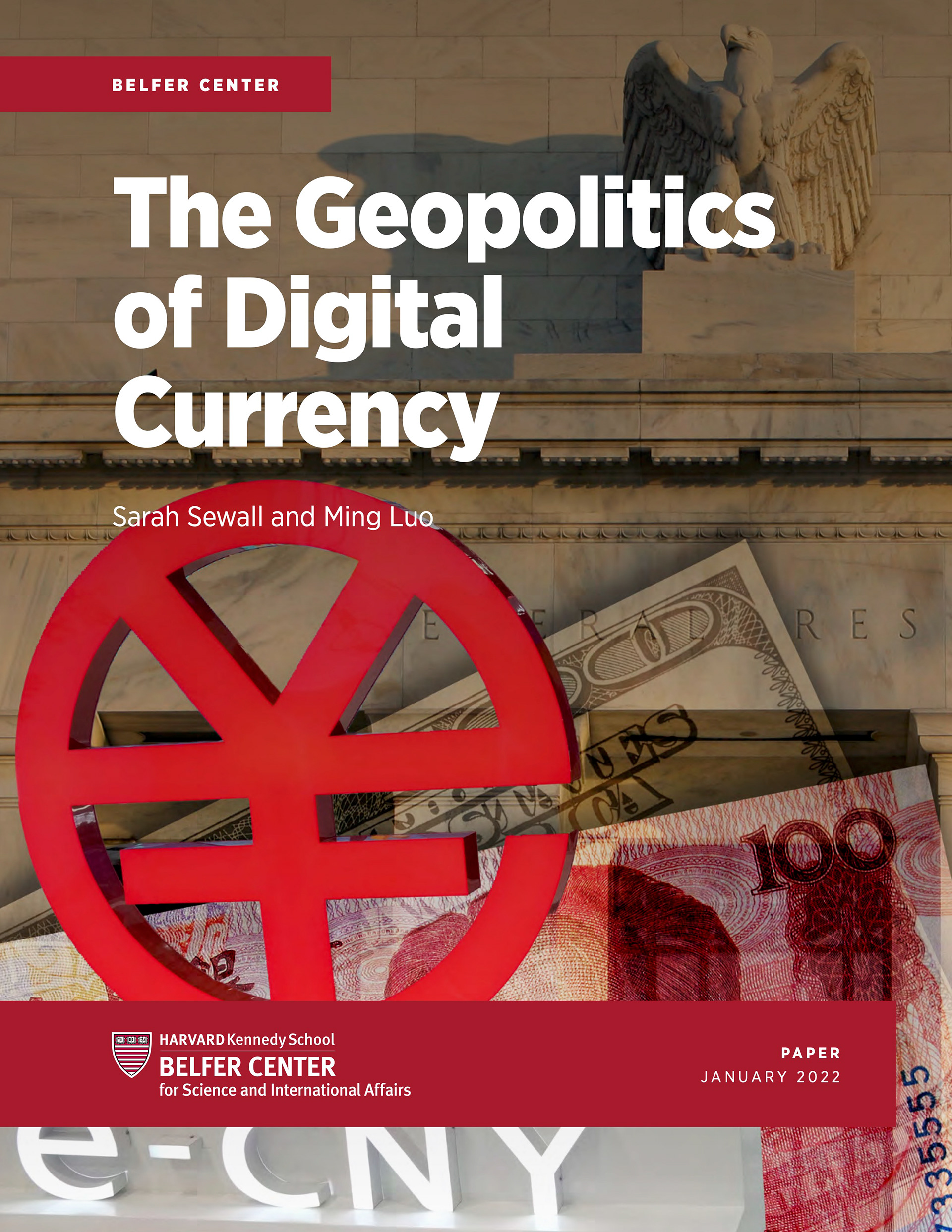
It's not always easy to choose an image for the cover of a report on a somewhat nebulous topic. Sometimes the authors have a specific idea and sometimes they just want you to put whatever you think is best. In these two examples, I created collages to help elucidate the titles of the reports—with varying levels of input from authors and other stakeholders.