Fall 2022 Newsletter Header Image - A Case Study
This one was tough. Our director, former U.S. Secretary of Defense Ash Carter, died suddenly in October 2022 and we wanted to highlight his life and legacy in our biannual digital newsletter. I set out to create a header image that focused on him, represented his legacy visually, and had the right "weight" to it.
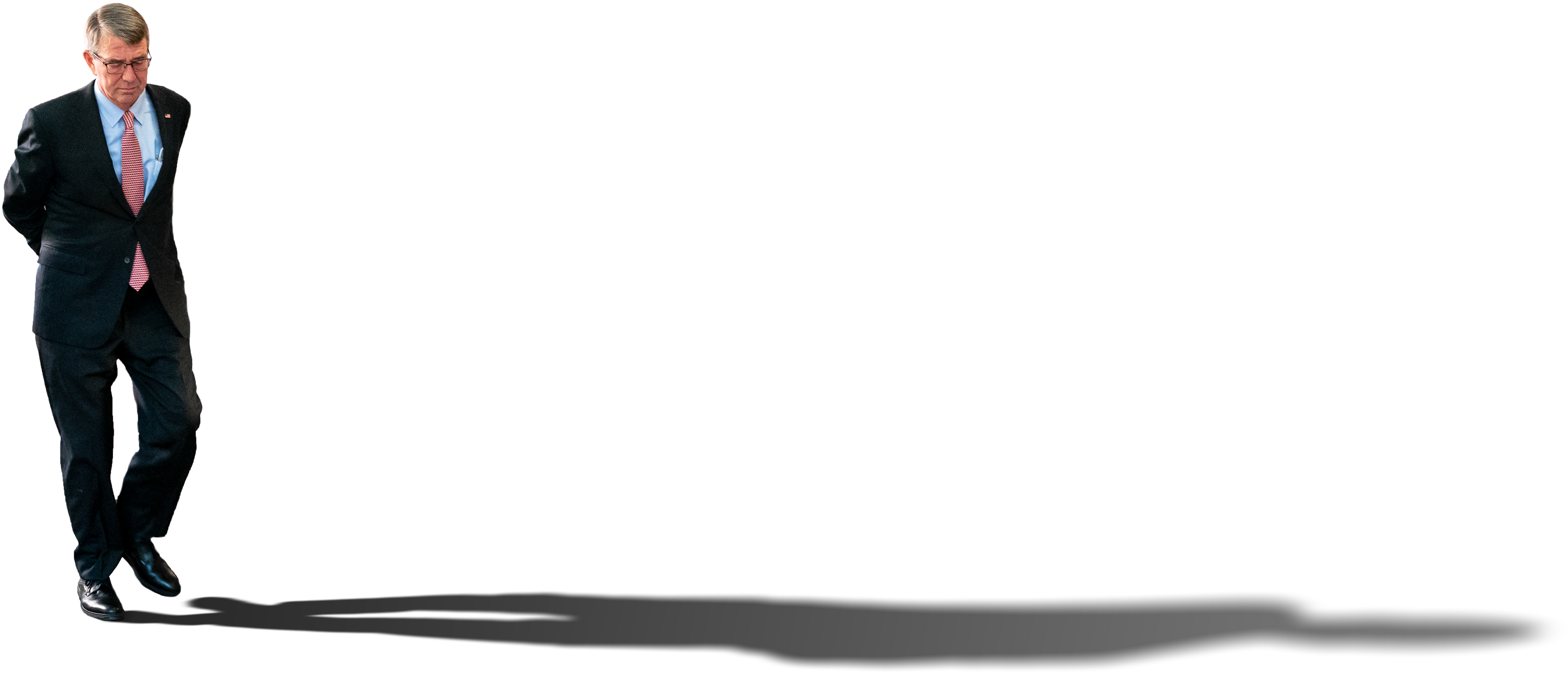
At right is the original image I came up with. Simply, he cast a long shadow. The image of him walking is a familiar one to those who knew his devotion to having meetings while walking laps of the E-ring at the Pentagon, a tradition he continued on the third floor of the Harvard Kennedy School. The shadow is cast forward to show his continuing impact into the future. Though this was meant as positive representation of his legacy, some worried it might be taken negatively, as if he was casting a shadow over others.
When President Biden spoke at Secretary Carter's memorial service at the National Cathedral he was thinking along the same lines when he quoted Ralph Waldo Emerson: “‘An institution is the lengthened shadow of one man.’ He might’ve been talking about Ash.”
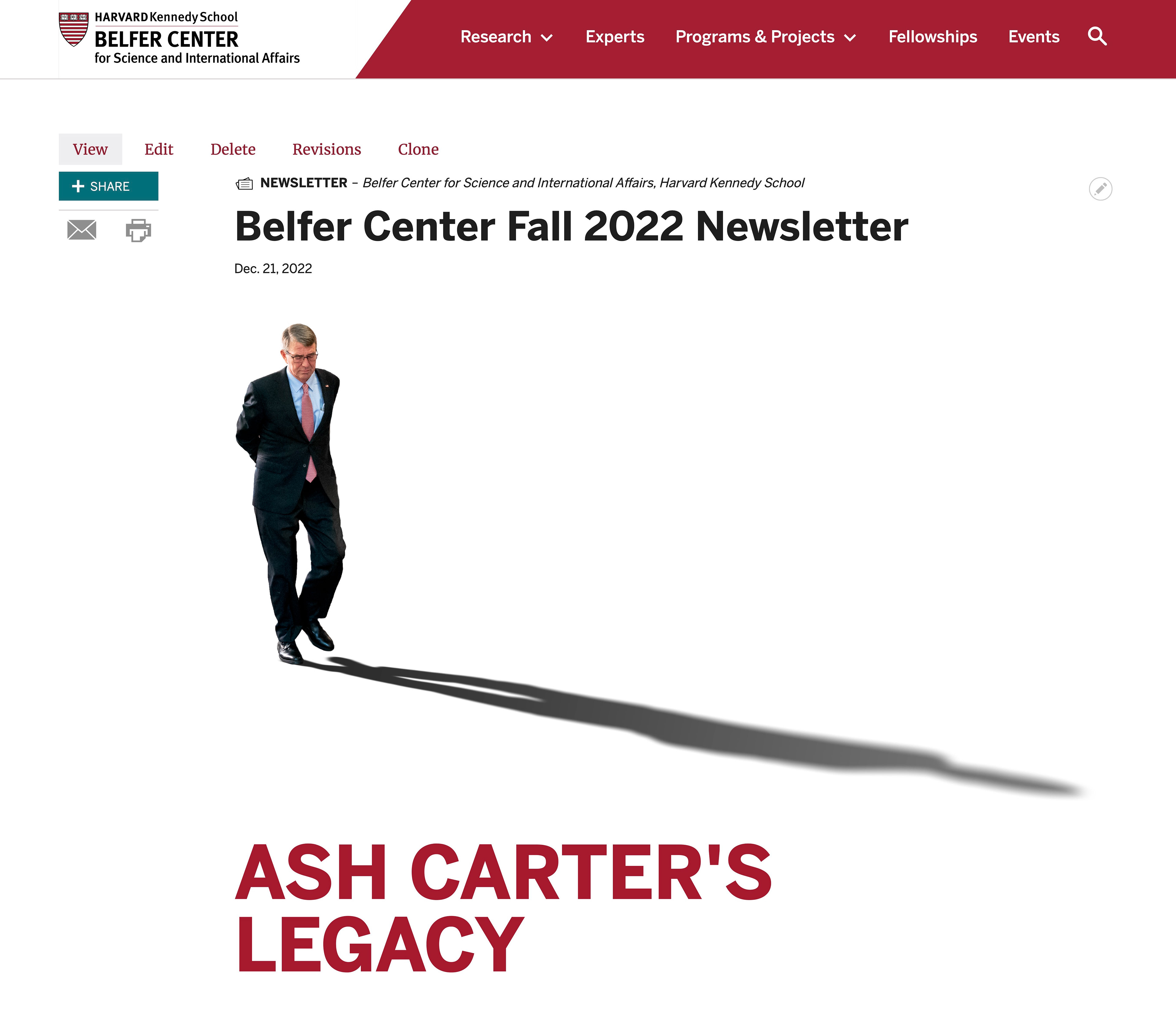
The image in context on the website. Since this took up just a bit too much space, I created a subsequent version where the shadow was more horizontal (below).
The next iteration (below) came from the desire to show more images from his life. While this was generally liked, technical issues with the way the website worked prevented this from being a real option as it wouldn't display the same way across all platforms. That, and a lack of other people, especially women, led to this design being put into the figurative recycling bin.
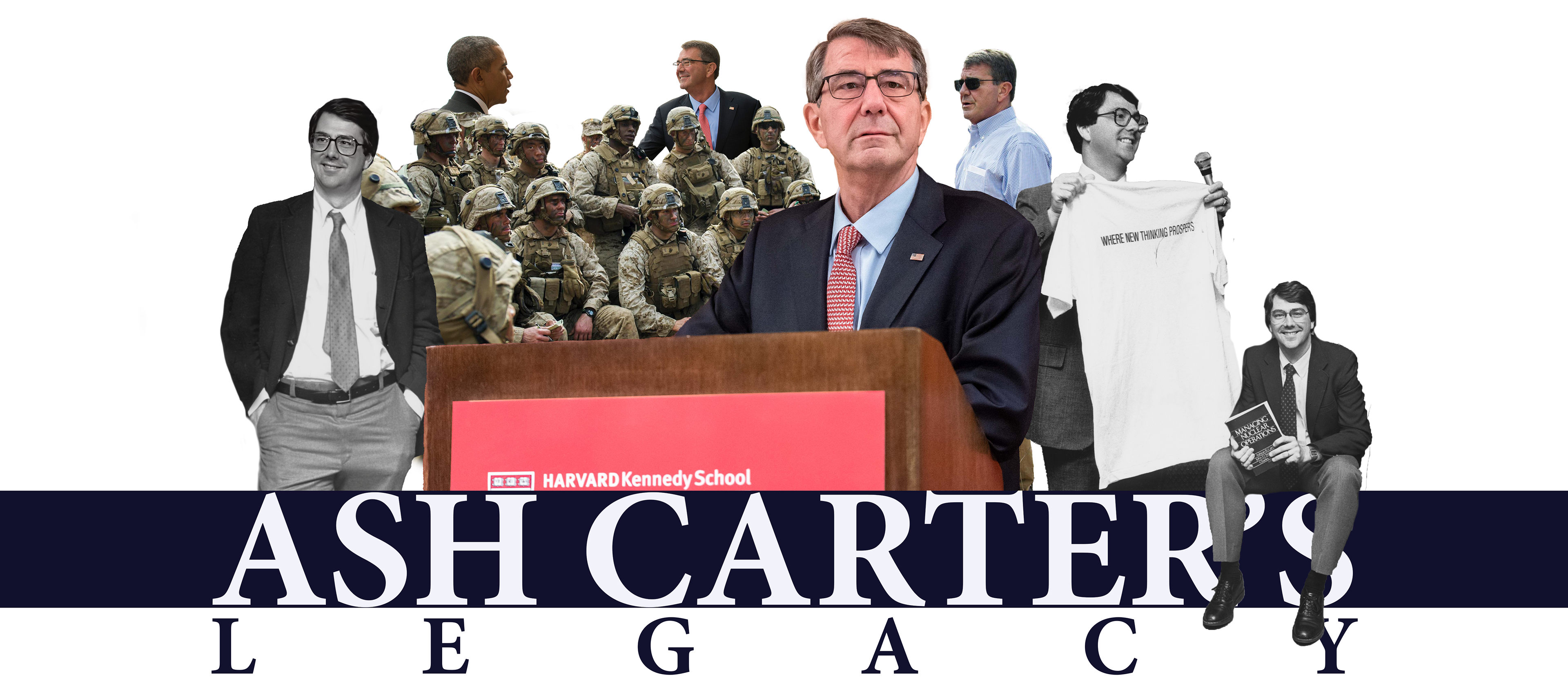
This option (below) was a quick mockup from the feedback of "let's just try a collage with the headline on top." A bit boring, but it was getting closer to the goals of showing Ash Carter at different stages of his career and with other people. I adjusted the blend mode to give the effect of overlapping slides. This idea planted the seeds that lead to the next, and final, version.
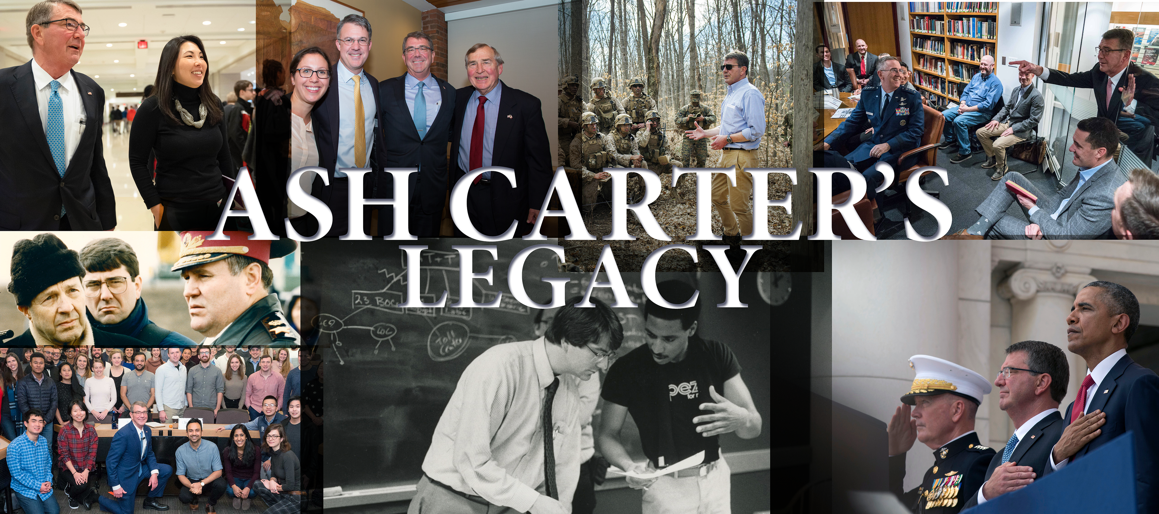
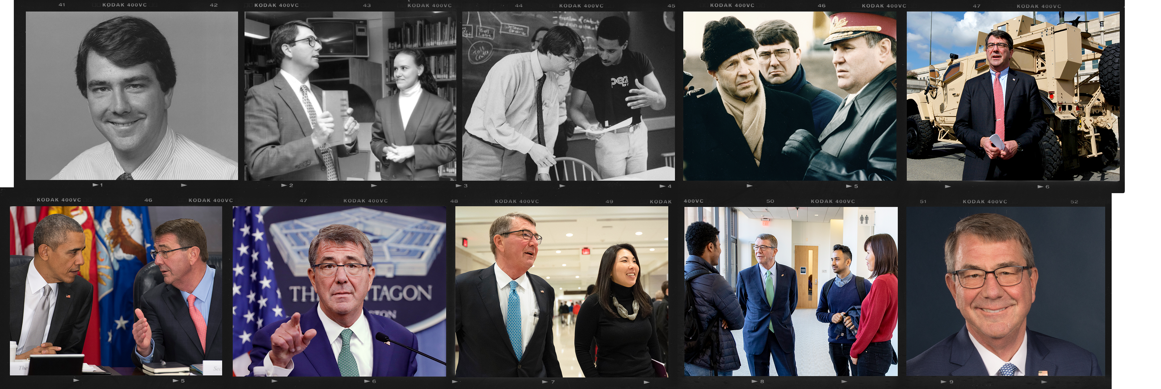
While digging through our physical photo archive and leafing through folders upon folders of contact sheets and negatives, I came up with the idea to use the film strips to frame photos from across the years as a timeline. This would give us a chance to show him with people, focus on his life's work, and get around the technical limitations of the website—a win, win, win.
I produced a hi-res scan of Kodak Portra film to use as the frame. I chose the squarer 4x5 format over a more standard rectangular 2x3 format to allow for a little more versatility in framing the chosen photos.
Starting at the top left, I placed images from his early days as a professor at what was then known as the Kennedy School of Government, his time as director for what was then known as the Center for Science and International Affairs, his various roles at the Pentagon from the 1990s to the 2010s, and then to his return to the Harvard Kennedy School and directorship of what had been rechristened as the Belfer Center for Science and International Affairs. Bookending the images with two larger portraits made sure that the focus stayed on him.
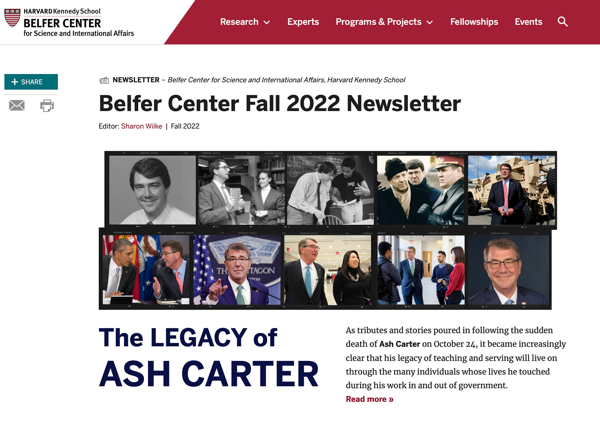
The final header image in context on the website.
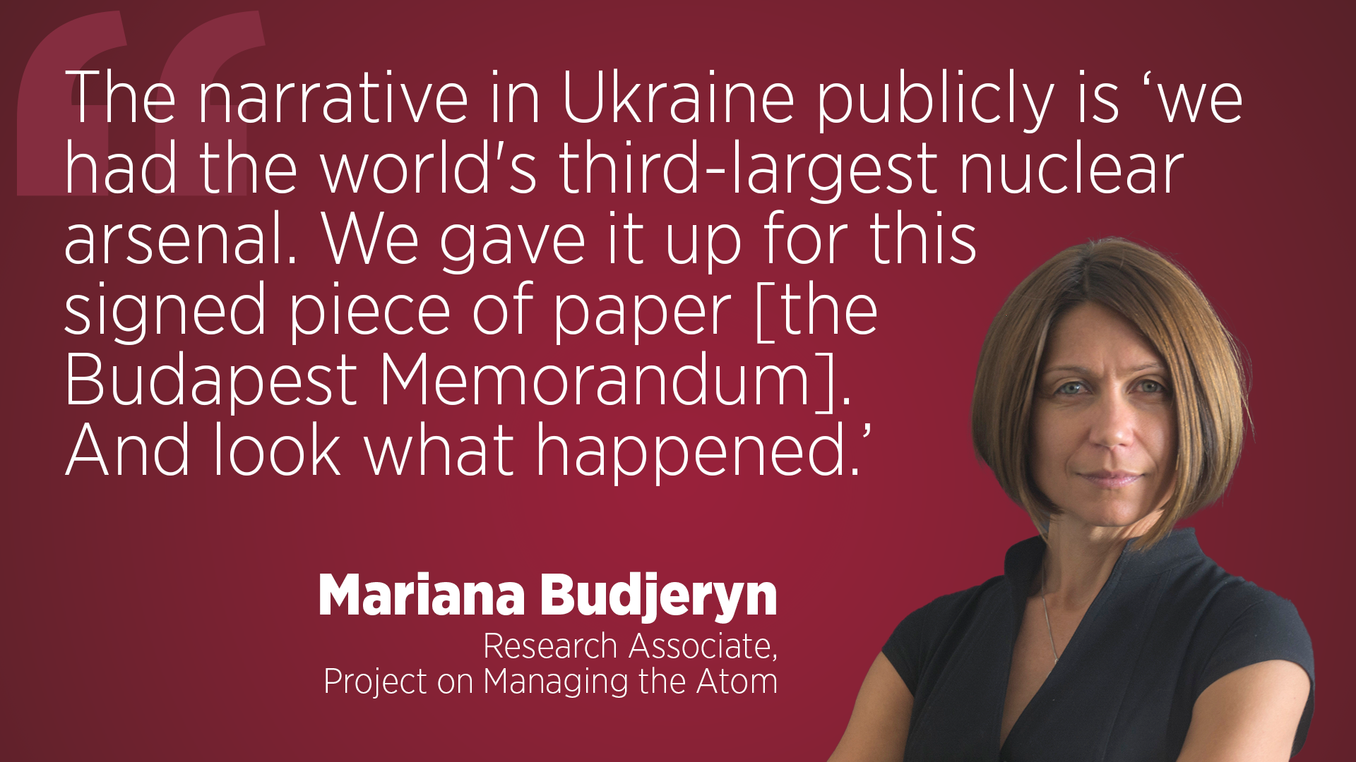
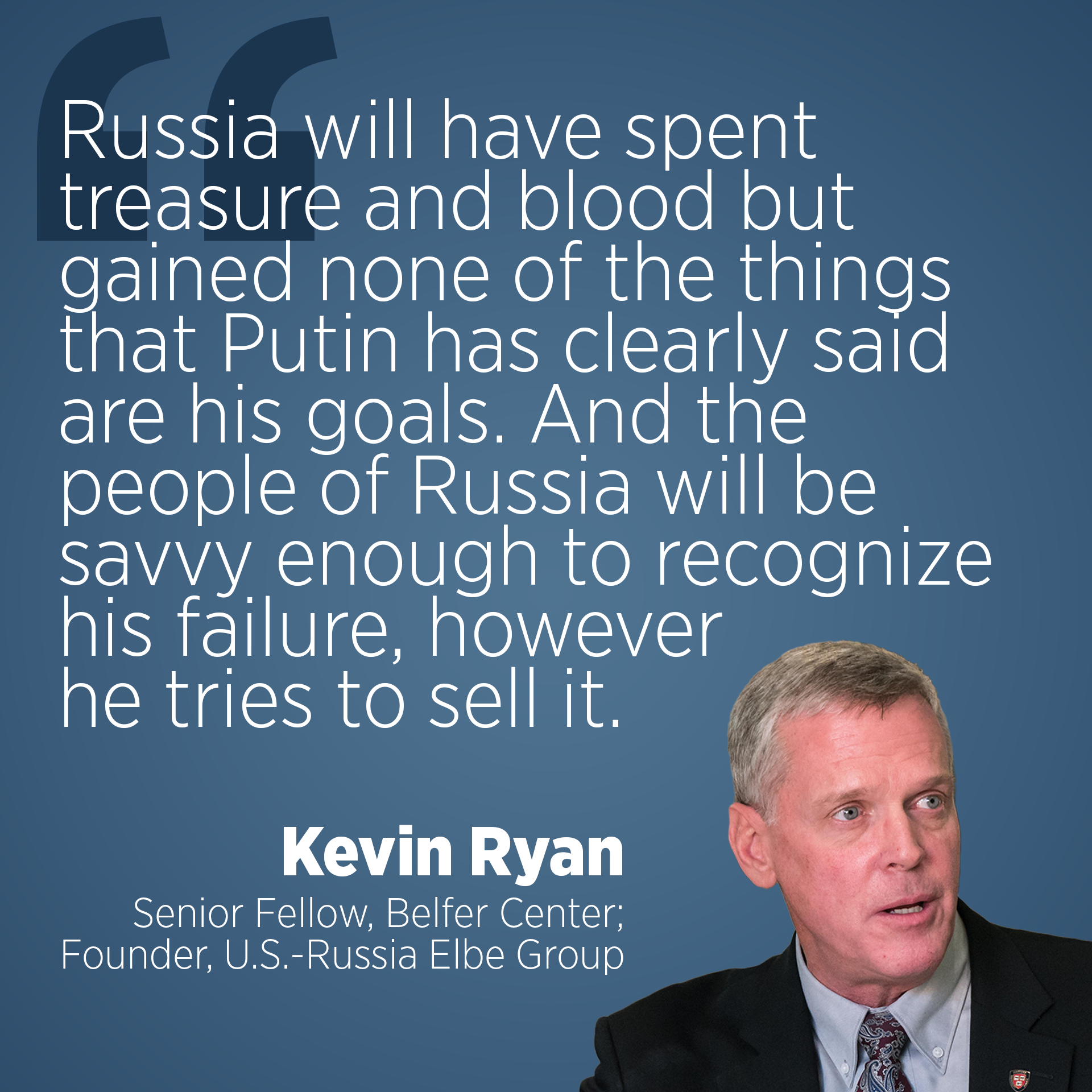
Quote Images for Social Media
To highlight quotes from events, op-eds, and interviews, I created this simple, bold format in both 16:9 and 1:1 formats suited for catching attention in social media feeds.
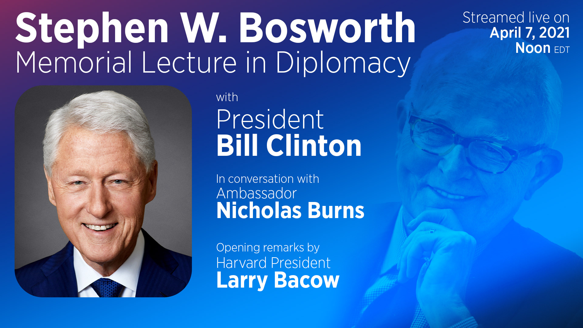
Event Graphics
This event image was used for a Belfer Center event streamed in collaboration with Harvard Public Affairs and Communications. This image was used for promotion on social media as well as a holding slide on the event stream and YouTube video.
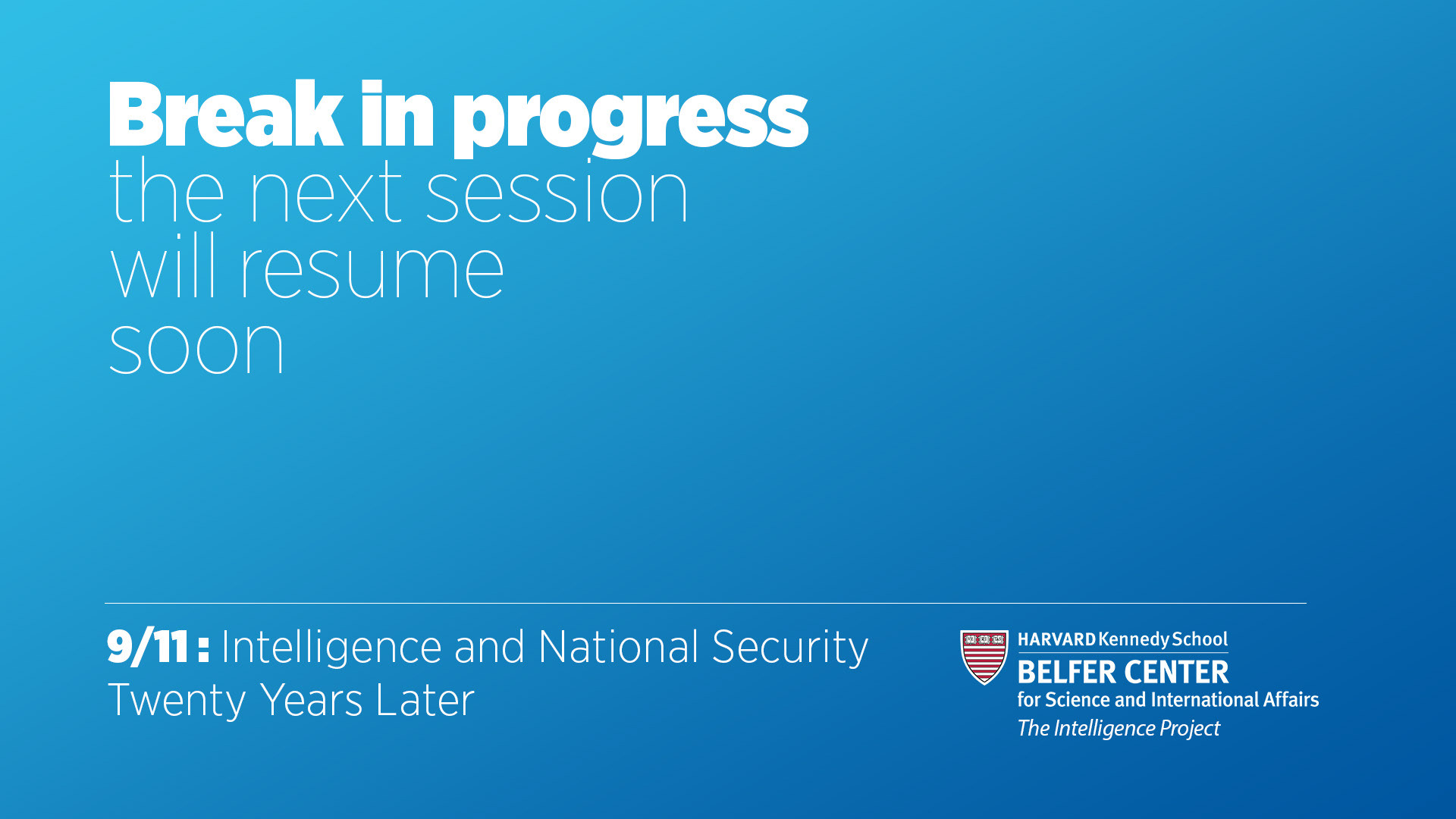
A holding slide used between sessions of a day-long hybrid conference. Blue was used as a calming color for an emotionally charged event.
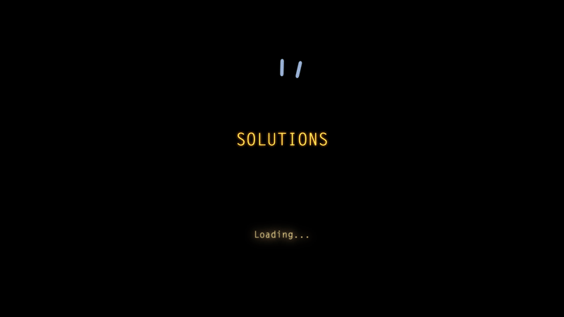
An animated event logo used as promotional material for an event on "finding solutions" in tech. The animation was used on social, the event website, and in a video introduction to the virtual event.
I created this graphic as a thumbnail for the video of an event. Using a photo I took at the event, I added big, bold text to be readable when viewed at a small size. The blue color was used to balance against the overall red/orange tone of the photo—also as a nod to Senator Markey's affiliation with the Democratic Party. To give the image some depth, the solid fill of the text was pushed to the background while the outline of the text stayed in the foreground to ensure the text was readable.
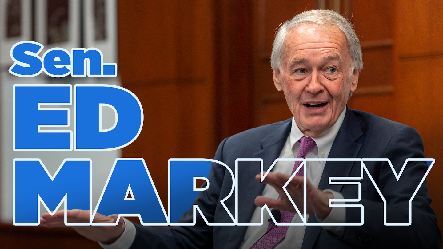

How it looks at thumbnail size.
Header Images
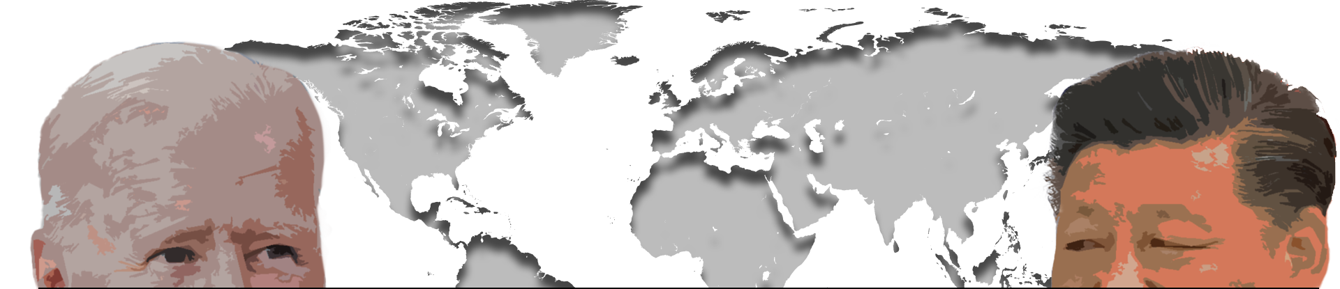
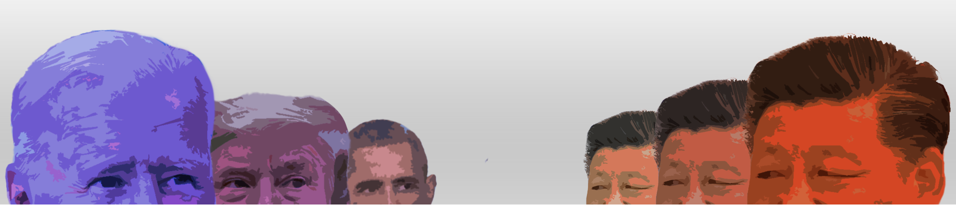
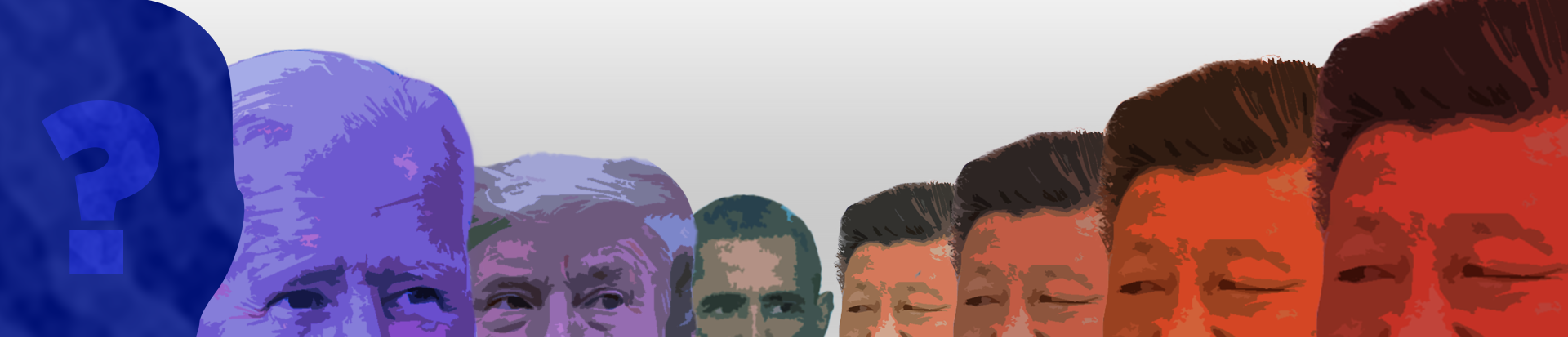
These three unused header images for a Center newsletter were iterations on the theme of the U.S.-China rivalry. While Biden and Xi were the two main figures, I also experimented with showing the steadiness of Xi's leadership across multiple U.S. Presidencies and into the future. It was ultimately decided to use a more abstract, less leader-focused image.